


As professional web designers and developers, you’re visiting probably well over a thousand websites a month in order to stay up to date with trendy design and to generate ideas for your own projects. With the design landscape changing so frequently and fast, how do we stay current, and more importantly, how do we stay motivated to create the best websites possible? Better yet, how do we find the time?!
Web design is the so hot right now and the web is constantly expanding, growing and flourishing. This is due to the fact that people are genuinely interested in getting involved with the development of the web. And this makes us…happy. That’s right, we’re happy that the web is growing and evolving at a rapid rate because it means that we’re 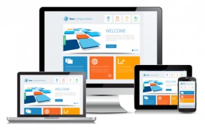 constantly seeing new design trends. We’re hoping that this will eventually result in a web that is based solely on excellent design rather than just function or purpose. The revolution may not happen yet, but we believe it’s in the works…
We’re been trawling the web looking for the most inspiring design trends so you won’t have to! Have a look, take some notes and get ready to revamp your web design style!
- Keep on Scrolling: When you combine storytelling with user experience it often gets you a long page narrative. Websites will keep on experimenting with this more and more in the future. Clicking is so early 2000. This new scrolling is called long scrolling and it means is that all of your website’s pages can be viewed by vertically scrolling up or down. Boom. Easy. People have less and less time these days and getting lost navigating your pages is the last thing they want to do. One page websites are the new things. Keep an eye out for parallax scrolling too, which is a special scrolling technique where the background images move by the camera slower than foreground images, thus creating an illusion of depth and adding to the immersion experience.
- Make it Personal: People don’t want their only reactions to be with machines. Writing personal content is the best way to make your customers trust you. Good content is the only way for you to connect with your online audience, so write it like a human would, not a Cyborg. It’s no big secret that people perceive and process information easier when it’s delivered with graphic aids. Big content blocks are also great both for responsive web design and storytelling. The blocks focus readers’ attention on one statement at a time and become even more powerful when combined with bold web fonts, lots of whitespace, separated with colours, and matched with strong images.
- Responsive Design!: This web design approach is aimed at crafting sites to provide an optimal viewing experience for customers. The easy reading, navigation, panning, and scrolling across a wide range of devices like mobile phones to desktop computer monitors is quickly becoming the standard for business, and if you don’t comply, your Google ranking is going to suffer. Responsive design makes set website design look archaic. Get on board if you want to stay up to date.
- Simple Design!: Simple design is a misnomer. It’s not implying that it’s easy to do, but rather it refers to the use of the best practices so site visitors get what they need without complication. Simple design embraces powerful images and meaningful content. It showcases purposeful navigation. Remember that ol’ saying: Keep It Simple, Stupid. This applies to the following:
- Simple Animations: The one other trend that has taken off after the release of iOS7 is the use of simple animations. These are subtle animations that give affordance and personality to the design that you see on websites and apps. You can see it in gestures, for example when you move up and down the chat bubbles in Messages where the bubbles bump against one another.
- Simple Colours: Over the last year, bold and bright colours have been making a name for themselves but light and subtle colour combinations are on trend now.
Psst…Pantone colours to watch out for:
Placid Blue: This is the ultimate light blue pastel shade. Associated with peace and serenity, this dreamy blue goes well with any pastel shades and classic bolds.
Violet Tulip: If you haven’t guessed by the name, this is a lavender shade. It’s a very romantic and vintage hue that pairs well with bolds.
Hemlock: This is a light green, almost pistachio, with a hint of the orient. It differs much from the trendy mint and emerald hues with its tenderness. All three of these shades perfectly combine with each other and with brighter colours.
- Tell Me a Story: Storytelling Design is similar to writing good content but I want to take it further. Storytelling design tells a story through concise, compelling copy coupled with strong imagery as users scroll down the page. It’s the best way companies can get their customers to connect with them. You’re telling a brand story now! You’re not just creating a website that brags how great your services are. The marketplace is saturated with businesses just like yours. But your story can make you stand out. So tell it well.
- Hey Flatty: Flat UI is a mix of fun and smooth colours, combined with complete and total simplicity, which brings websites and web applications to life. Giants like Apple and Microsoft are getting on board, so it’s time for you to embrace it too. Flat design focuses on simplicity and clarity and helps websites get rid of their excess clutter. Users can then focus on the content and overall the user experience becomes more enjoyable. Flat UI just going to keep growing so take the time to study it.
- Video Killed the Radio Star: There are only so many great copy writers out there and you don’t want your customers reading all day. Change things up by creating videos that get your message across. You can get creative and even cheeky with video. The right videos can go viral, so it’s worth considering if you’re looking for potential word of mouth advertising. Video content is becoming easier and cheaper to produce and crisp HD photos can easily make your website look professional, attractive while getting your message across. We’re social animals and there’s no better tool than a good video for storytelling. Videos can stir our emotions and create a closer connection better than just well written text. Watching a video can entice your users to linger longer on your page, thus allowing them to get to know your brand better.
- Don’t Believe the Type: Make a name for your brand with personalised fonts. Fonts have evolved in the last few years, with services like Google Fonts offering hundreds of free fonts to choose from. There is a definite potential to create something more memorable with branded fonts to get your message across. The websites using these fonts say that they’re independent, trailblazing and downright sassy. It’s a strong message that works. In addition to this, big chunky font is trending.
- Take a Ride: Fixed Navigation is the new way to go. Websites that integrate social media, search and even purchase options within their fixed ‘navbars’ make the user experience more accessible and continuous. We’ll be seeing plenty of changes in this area in the years to come. The main purpose of the fixed technique is to keep the navigation bar constantly visible for the users as they scroll down which makes it easier for them and makes the experience more enjoyable. Stripped-down navigation is a trend that looks set to grow in popularity and we’re going to see a lot more focus on icons, roll-downs, and navigation that shrinks as you start to scroll down the page.
- Blurred Lines: Since the release of iOS 7 last summer, designers have been using blurred backgrounds as a source of inspiration like crazy. You essentially overlay interfaces, creating a “shower door” type look with these multiple blurred backgrounds. It actually creates pretty attractive nonlinear gradients which can make your website stand out.
And there you have it, some of the best trends coming your way in 2014. Just remember that a decent design should serve both practical and aesthetic purposes. The best design comes from designing for the user’s needs by applying best practices. Don’t follow trends for the sake of it – if you don’t like a certain trend then use a different technique that suits your style.
Now, if we could just a drumroll so we can say a proper goodbye to the following trends that have assaulted our eyes for too long…
- Overused stock photos
- Auto-play videos and music
- Automated popups
- Advertising sidebars
- Inane blog posts
- Loading and Reloading pages
- Modal windows with hidden or tiny close commands
- Small, impossible to read font sizes
- Long shadows: why?! WHY?!!
- Hipster icons and logos
Goodbye and good riddance!